As I was settling my check in a New York restaurant earlier this year I was reminded that not all conversion secrets are reserved for CRO experts.
Waiters know them too!
In this case the waiters conversion goal was getting more tips. Let’s take a look at her rather effective conversion tactic.
Receipt for increased conversion
I immediately noticed her scribblings on the check – and it gave a clear hint about what she wanted me to do. And she got it. Not only was I given a heads up that tips was not included, but conveniently also the amount should I decide to choose 18, 20 or 22 percent tip. This made it very easy for me to understand what was expected of me. Had I not known that tipping accounts for much a waiter’s pay in the US this would have definitely helped her chances of reaching that goal.
Without those simple strokes of a pen I might not have noticed the info about the tips, or simply could’ve forgotten with all my distractions and lack of attention. The waitress was well aware to the secrets of visual cues and how to increase conversion rates. This little trick is not to be underestimated.
Tell me what you want
This can be an arrow pointing where you want me to look. It can also be, like in the case of the waitress, a framing of the content she wanted me to focus on.
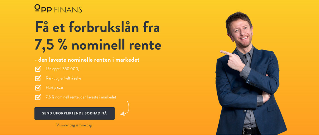
Or it can be as subtle as a picture of someone looking towards the area you need users to zero in to. Try it yourself, next time you’re on a crowded street start looking straight up into the sky. You’ll soon find that more people are looking up to see what you are looking at. That’s the effect of a directional cue.
Attention before conversion
Online you have only a few seconds to catch the attention of your visitor. We rarely read a web page from top to bottom. We don’t even always read from left to right, but scan the page back and forth based on different cues. We have done several A/B tests where visual cues have proven to be highly effective.
Take this example
It might seem obvious, and I’m sure you wonder if it’s really necessary. The numbers say yes – conversion rates increase when you make overly obvious what you want – in this example get the visitor to click the button.
What is your goal?
Where do you want to direct the users attention? On a button, a form or a headline? Choose a fitting cue or several, subtle or obvious, to guide your visitors’ eyes. I’m betting you will definitely see increased conversions. Try it out and let me know how it goes, I’d love to hear your experience.

